This Documentation is used for Classy – Minimal Multipurpose Shopify Theme.
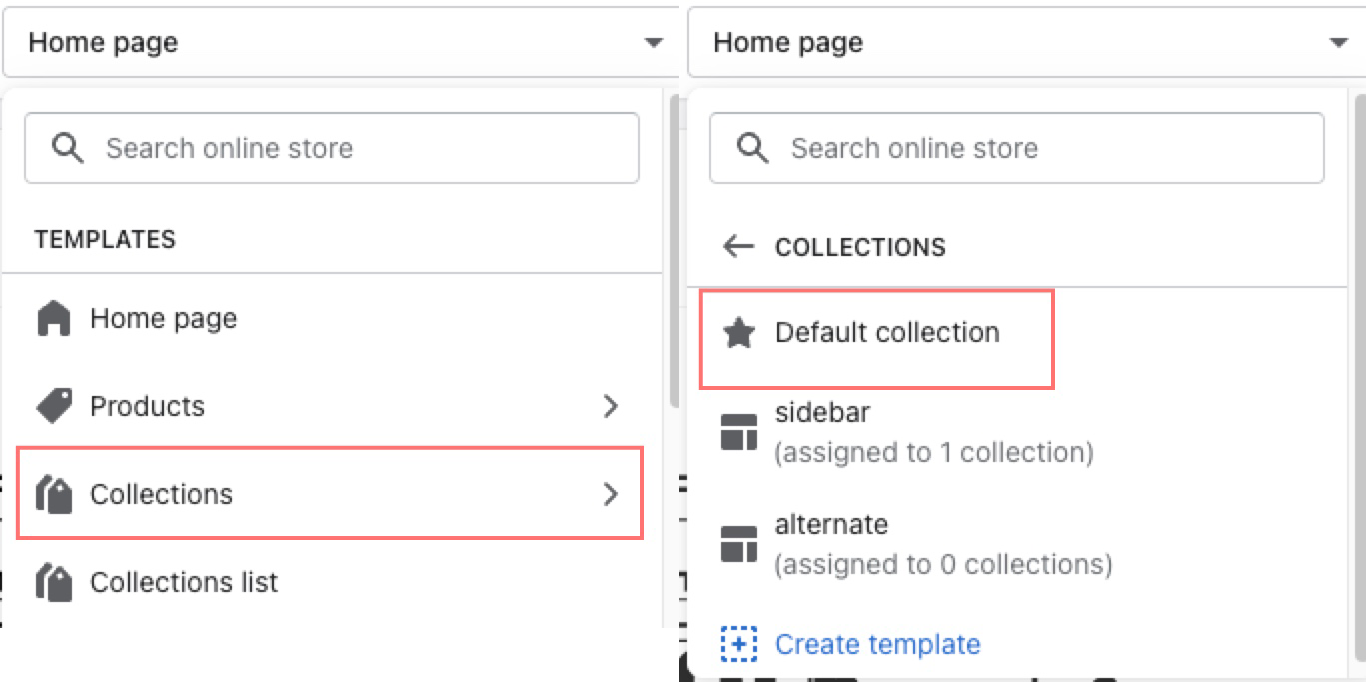
- In the theme editor (Customize), open the template selector.
- Select Collections, then Default collection.
1. Collection Template
2. Collection Sections
This Documentation is used for Classy – Minimal Multipurpose Shopify Theme.
- In the theme editor (Customize), open the template selector.
- Select Collections, then Default collection.
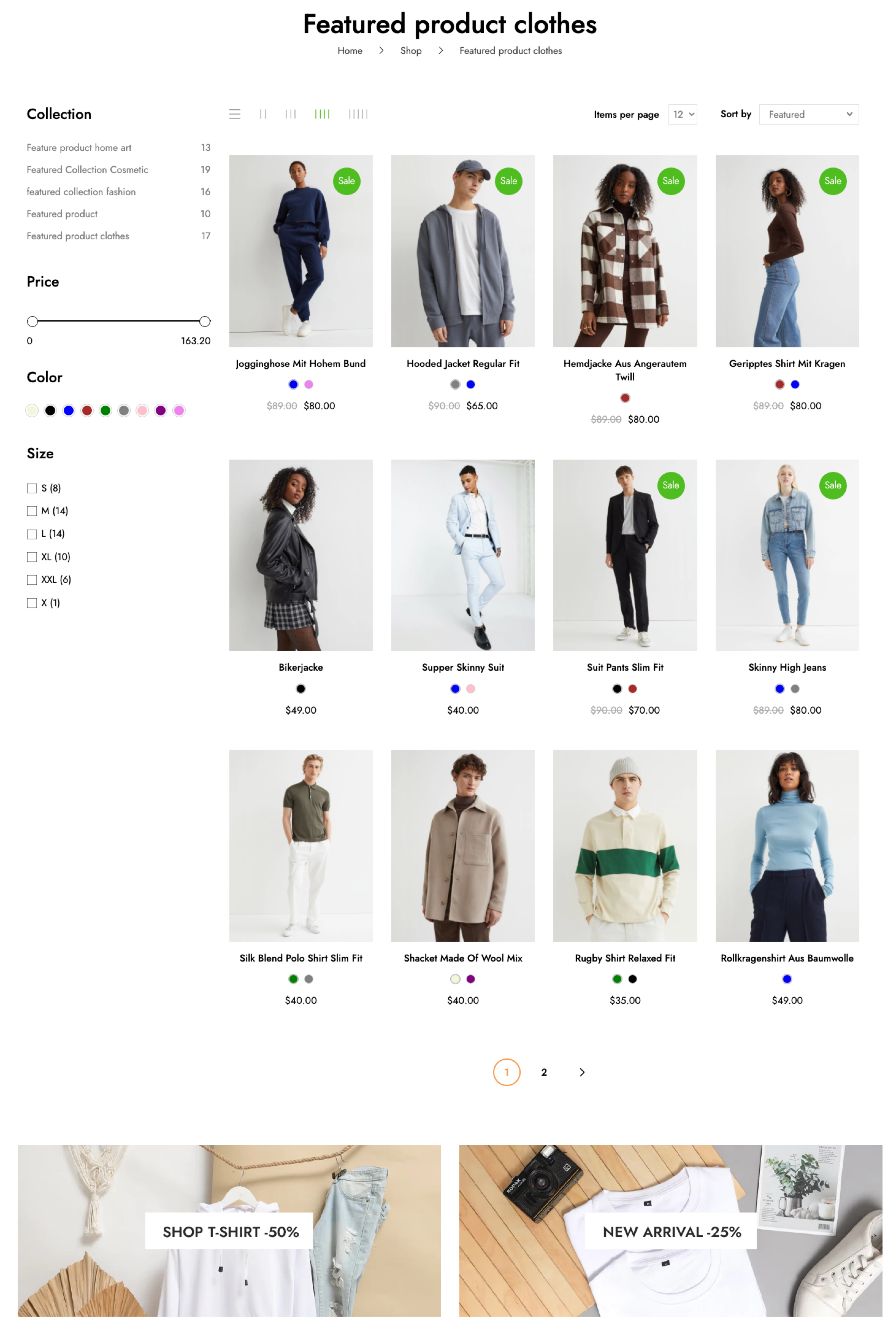
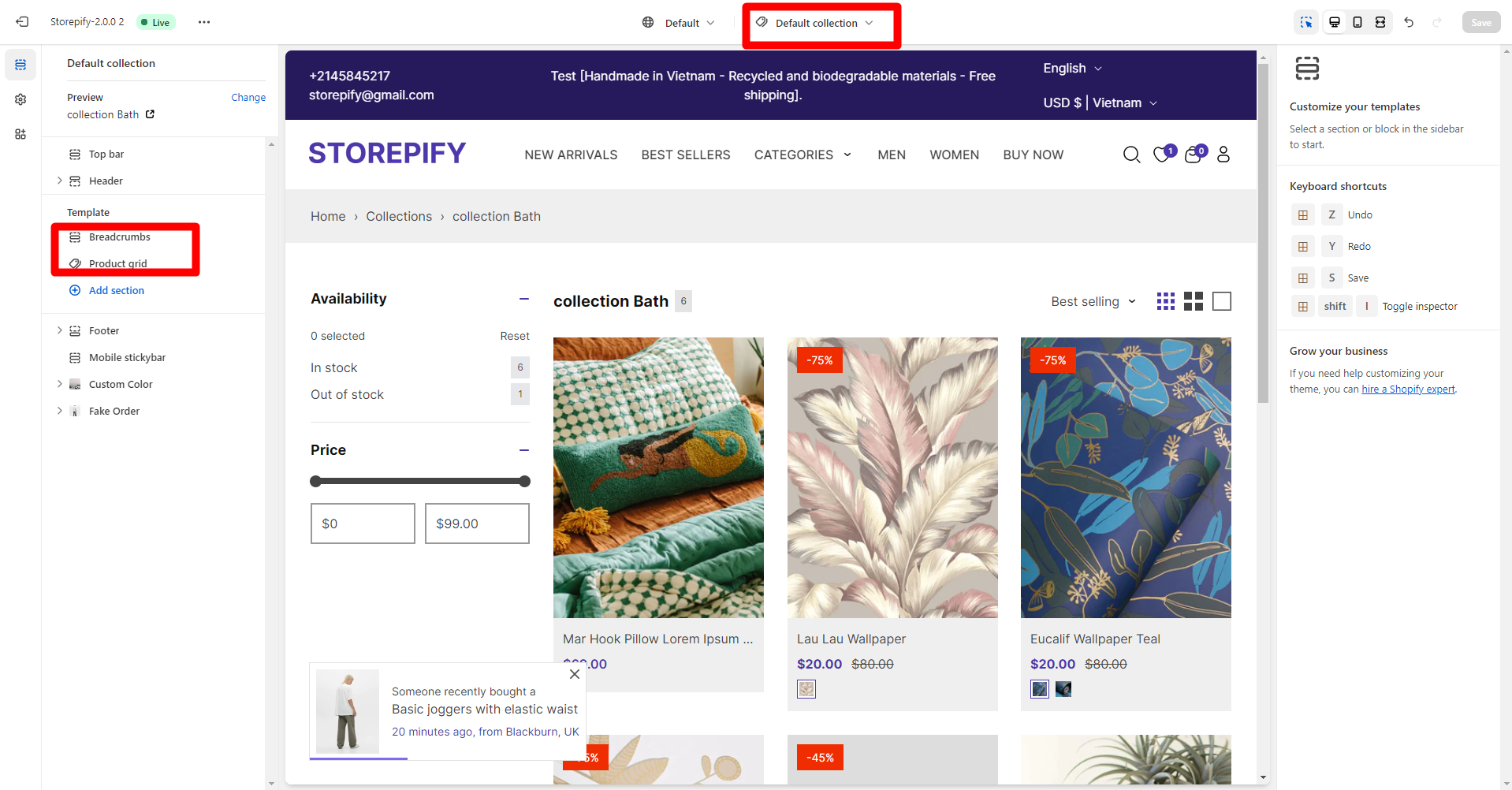
- On the left-sidebar, add Product Grid.
- Make necessary changes > Save.
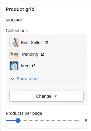
- Select collections for the sidebar and set the number of products per page.
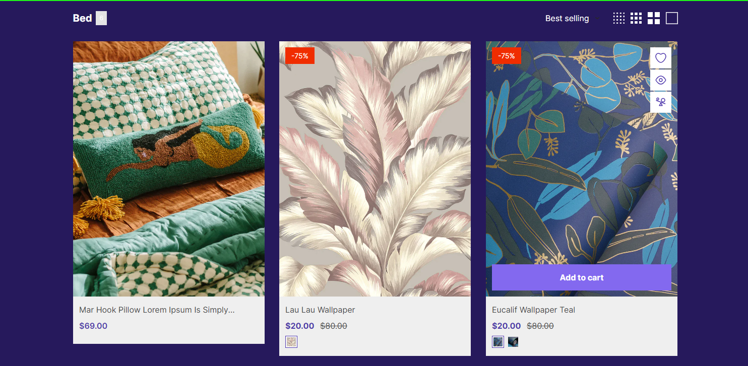
- Show vendor, second image on hover, product rating , quick add button on product.
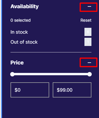
- Enable filter & sorting.
- Select type for filter and filter price.
- Set price ranges: separate price ranges with commas.
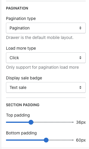
- Select type for pagination, load more button, sale badge.
- Set top padding and bottom padding.
- In the theme editor (Customize), open the template selector
- Select Collections, then Default collection.
1. Collection Template
By default, merchants can customize using the Default collection template. Merchants can add a new template directly to the admin page rather than the default.
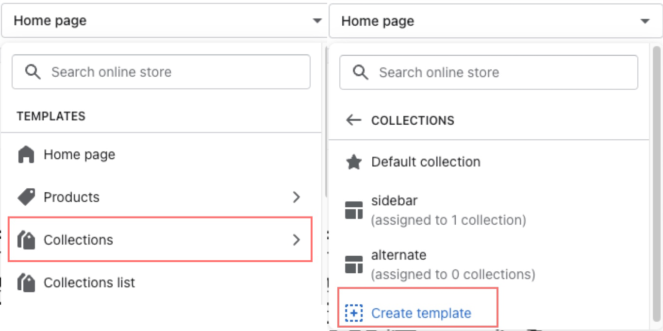
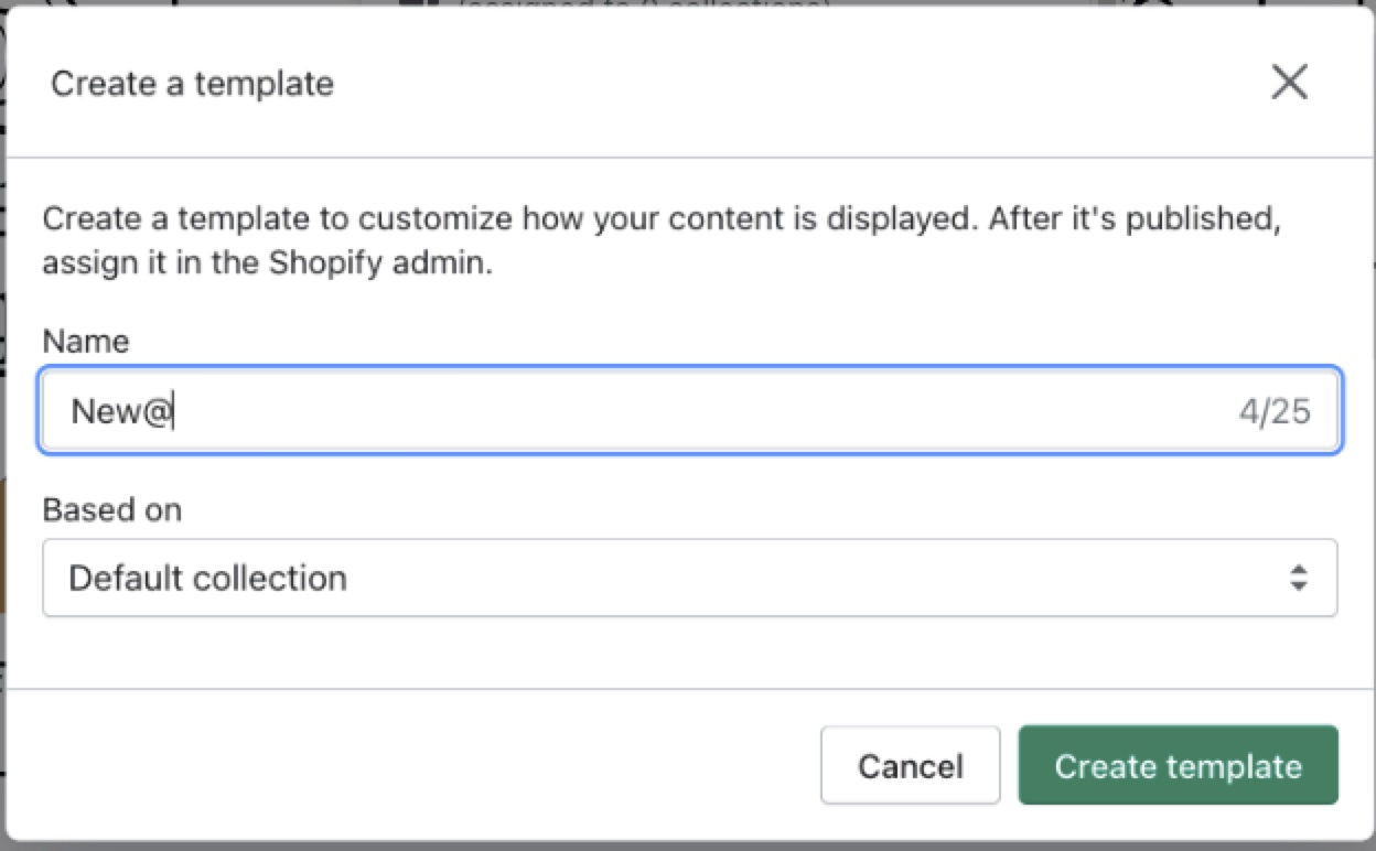
1. In the theme editor (Customize), use the page selector to open Collections > Create template.
2. Add Name in the provided field for the new template.
3. Choose the suitable value in the Based on dropdown, then select Create template.
2. Collection Sections
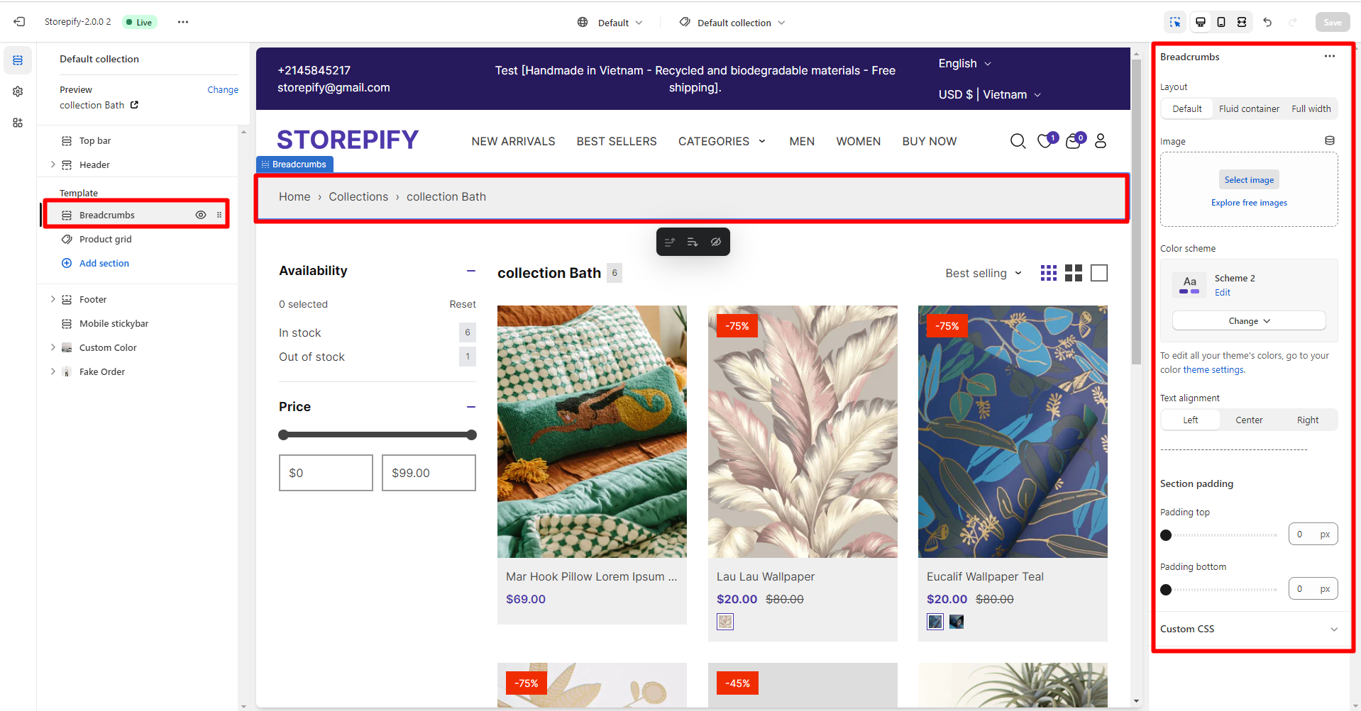
The Collections page allows you to edit two sections: breadcrumbs and product grid.
Breadcrumbs
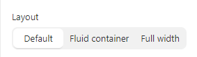
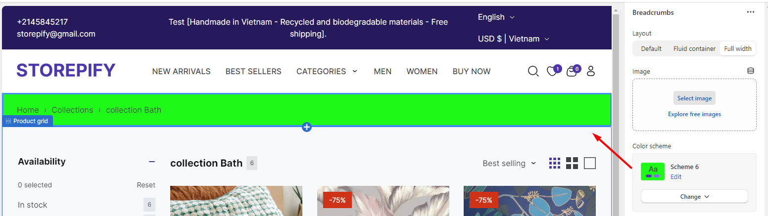
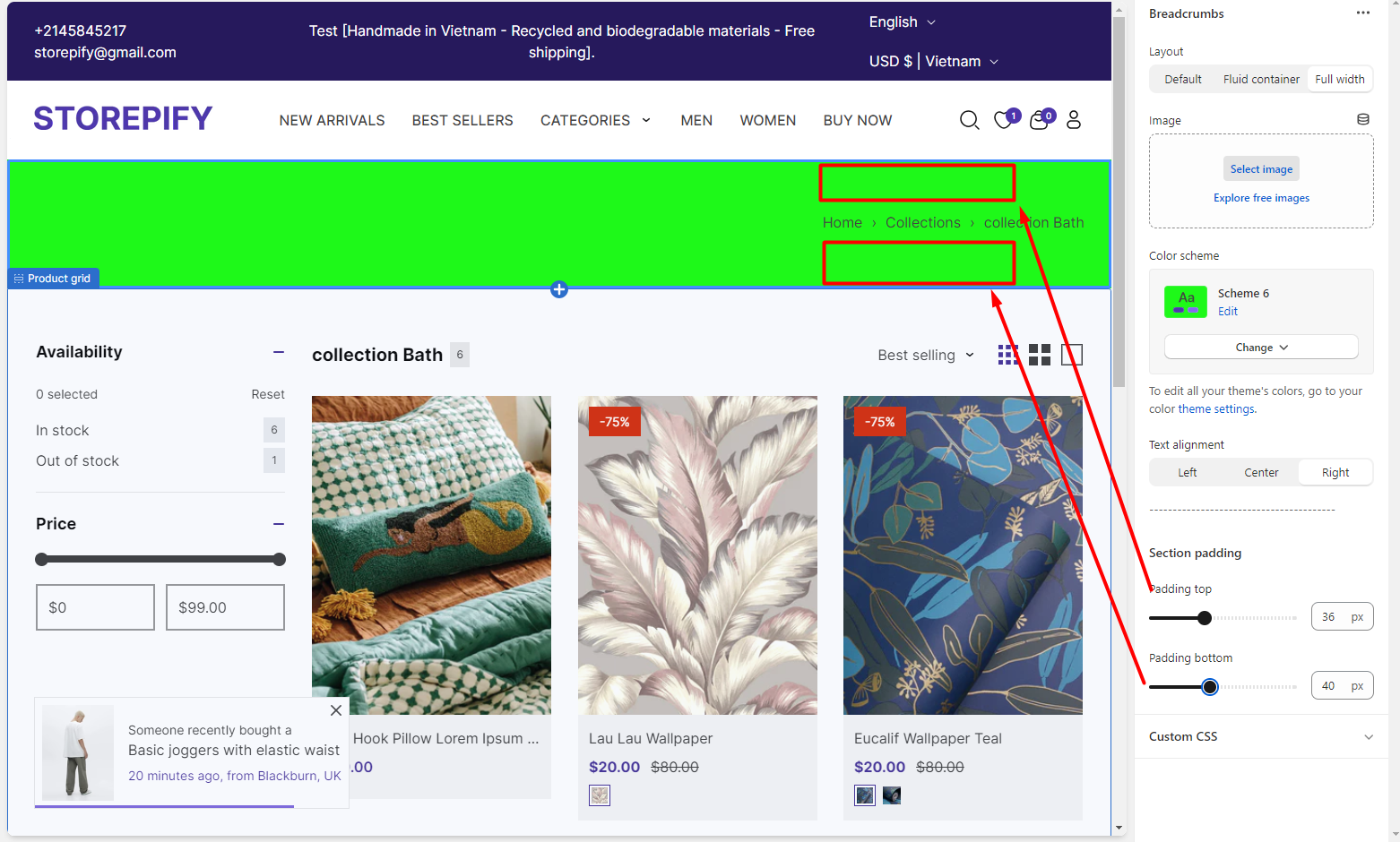
Layout
There are 3 layout types you can choose from: default, built container, and full width.
Default:

Fuild container:

Full width:

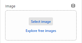
Image: You can add an image right above the breadcrumb section.
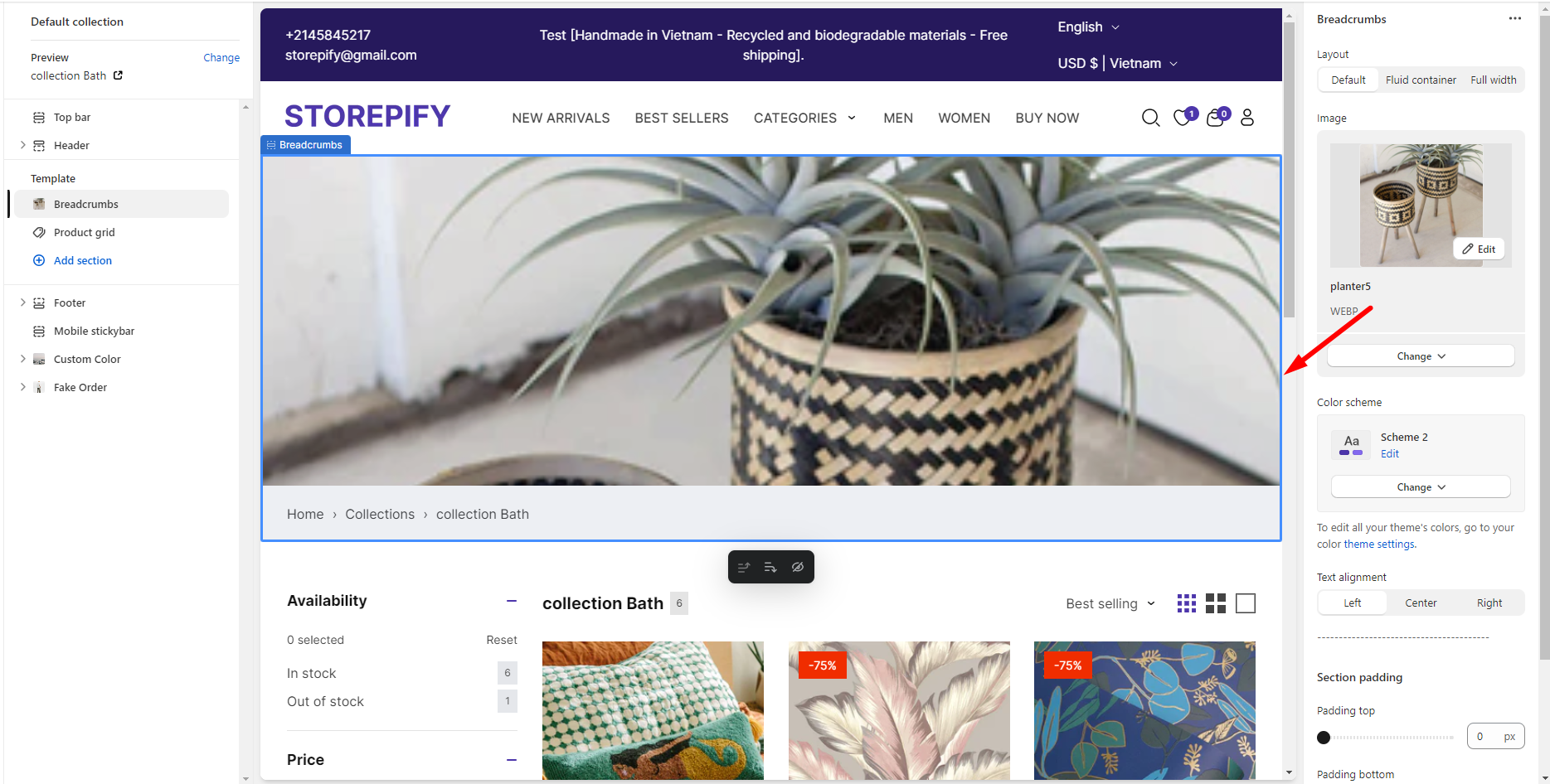
Color scheme: You can edit the color of the breadcrumb here.
Text alignment :
There are 3 text alignment types you can choose from: left, center, and right.
Left

Center

Right

Section padding: Adjust the spacing of the breadcrumb text from the top and bottom margins.
Product grid
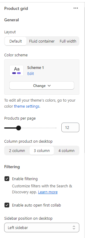
Layout
There are 3 layout types you can choose from: default, fuild container, and full width.
Default:
Fuild container:
Full width:
Color scheme: Choose a color scheme for the collection list.
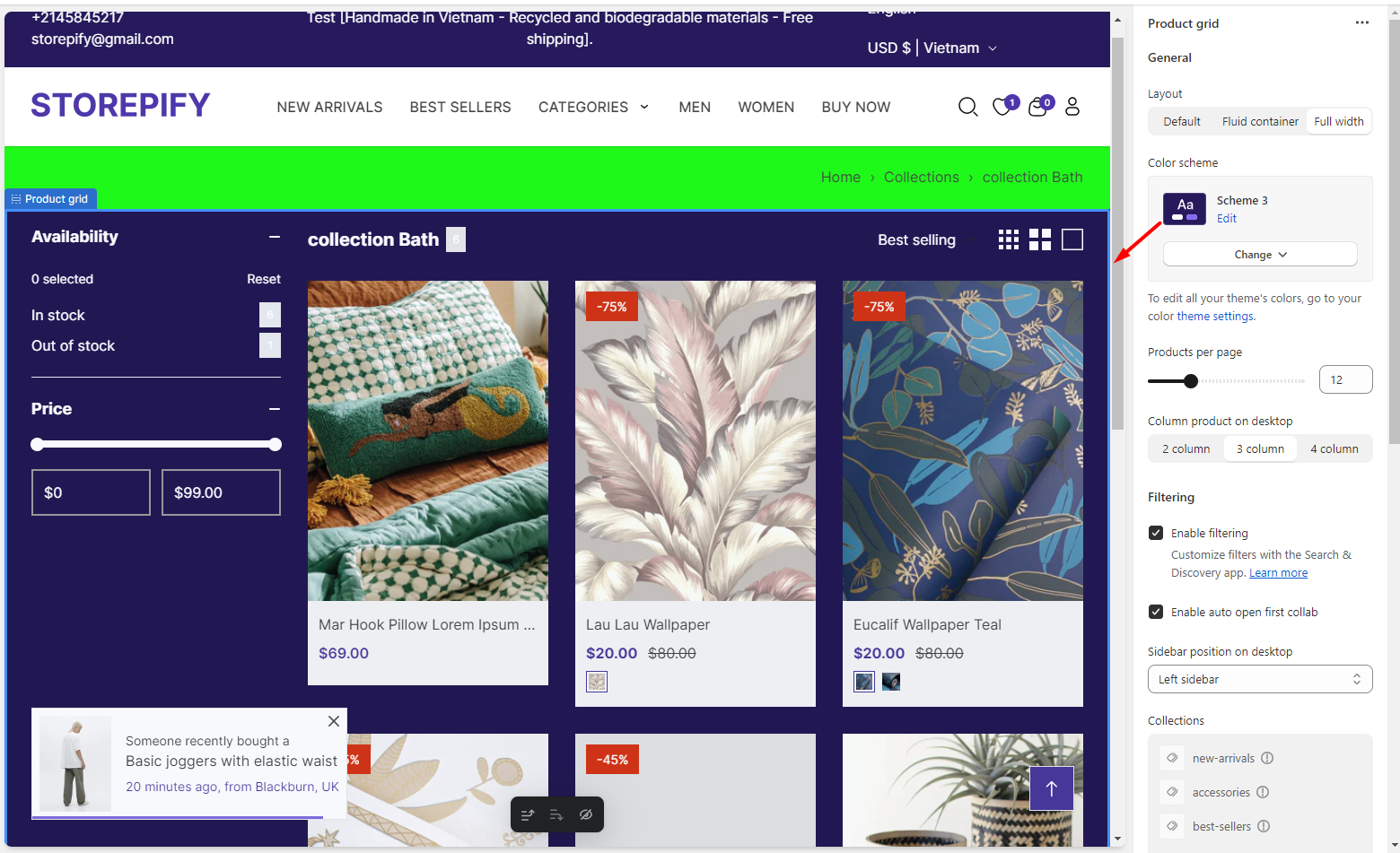
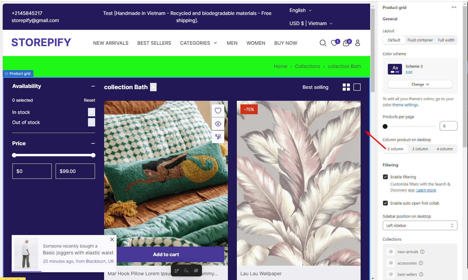
Products per page: Sets the number of products that are shown on the page.
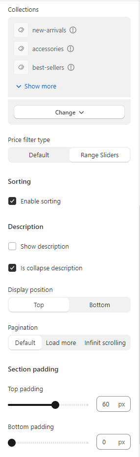
Filtering
Enable filtering: Activate this option to enable the filter.
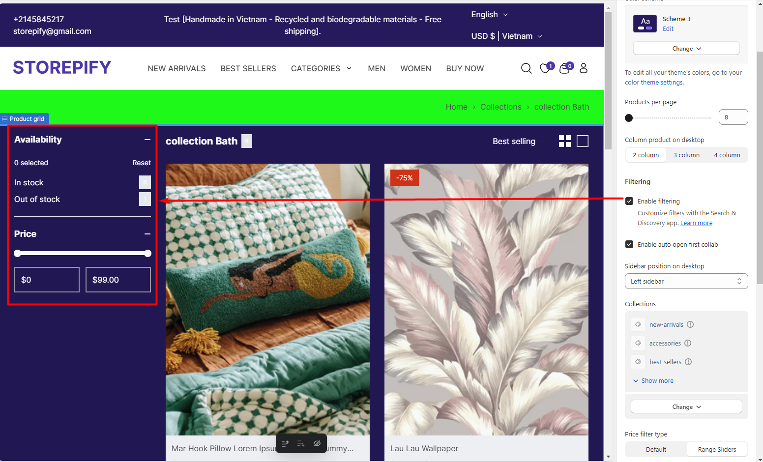
Enable auto open first collab: Automatically open the filter for users.
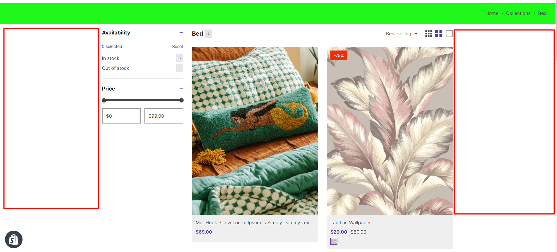
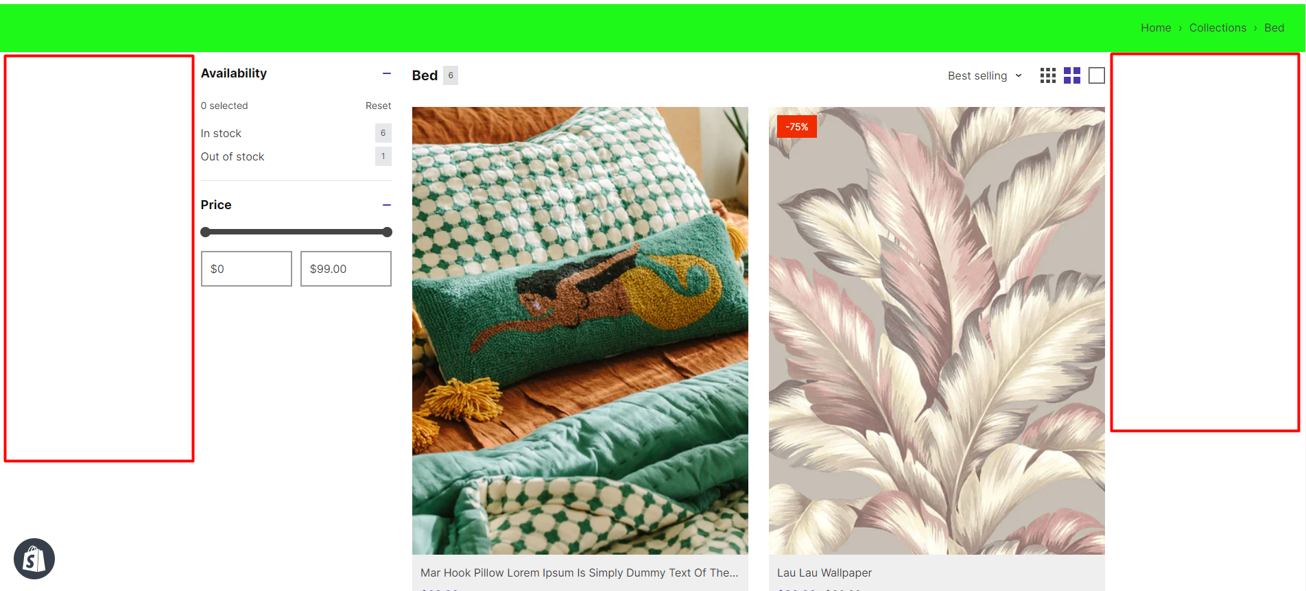
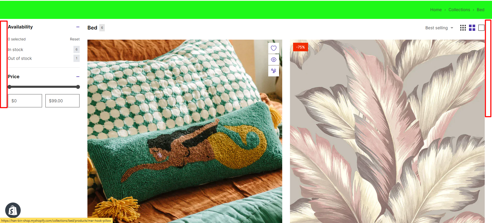
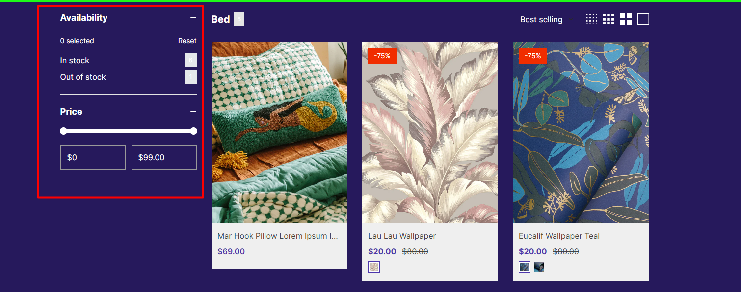
Sidebar position on desktop: Choose the display position of the sidebar on the collection page.
Left sidebar
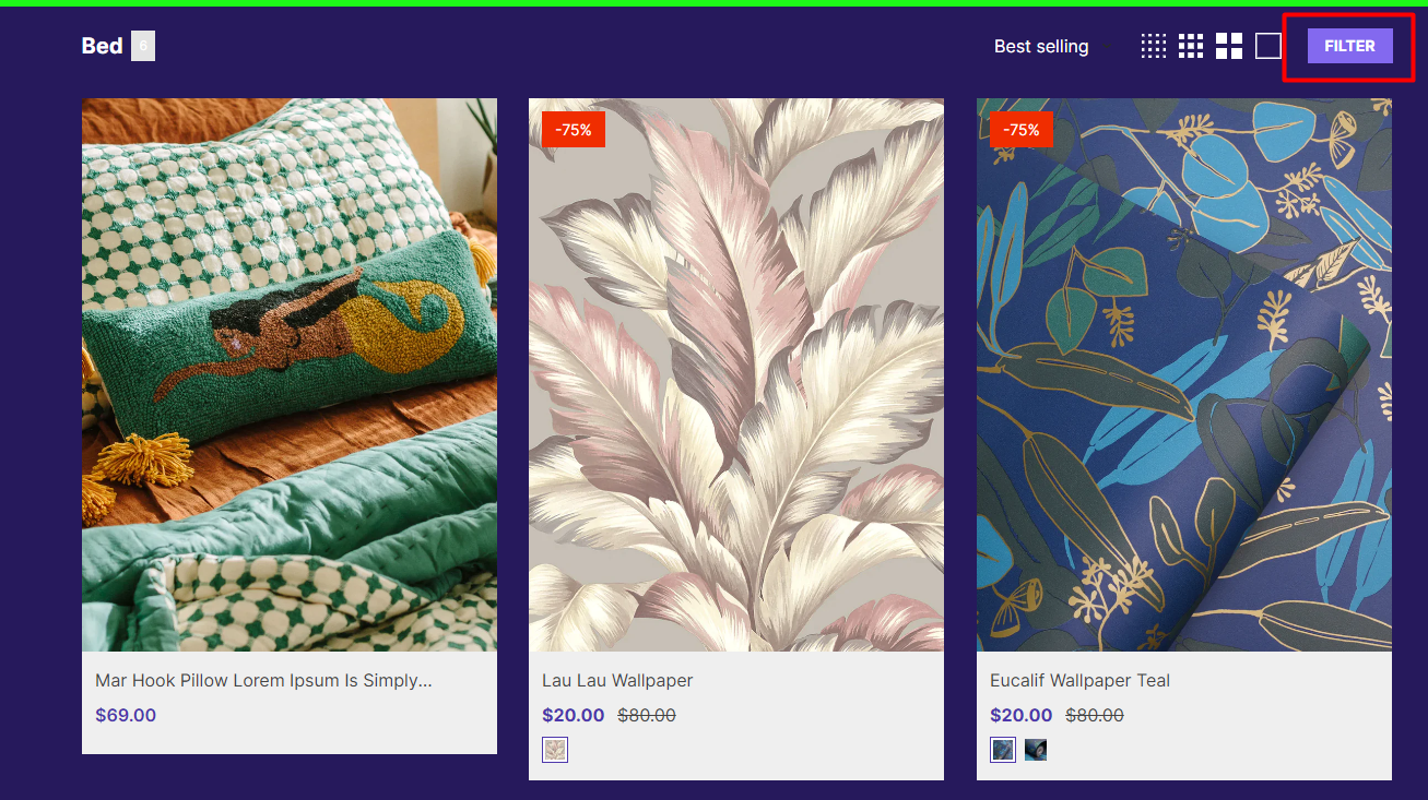
Drawer sidebar
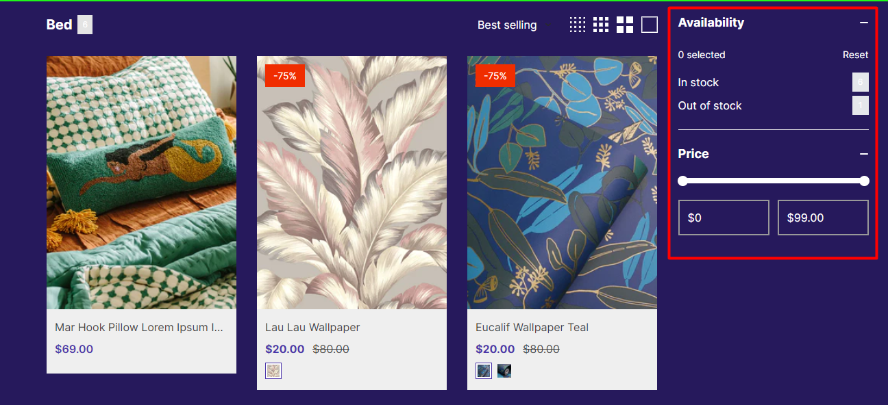
Right sidebar
No sidebar
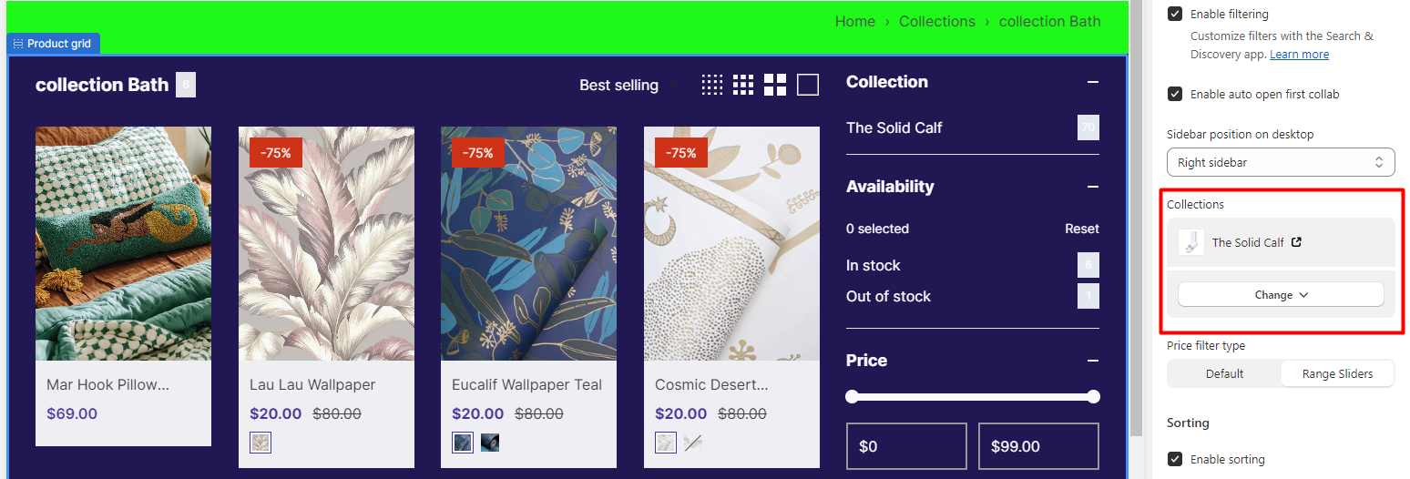
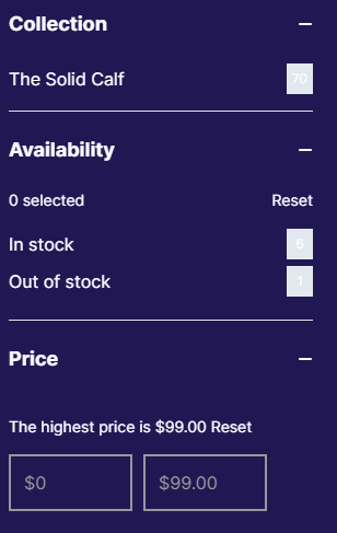
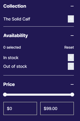
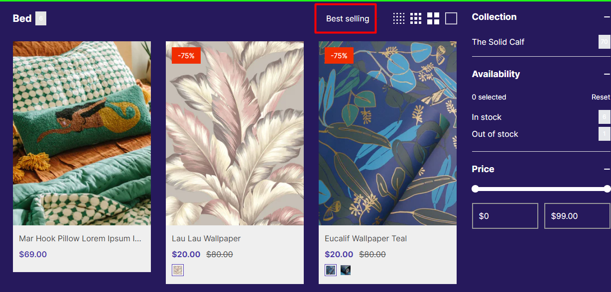
Sorting: Show sort filter.
Description: Show description and is collapse description.
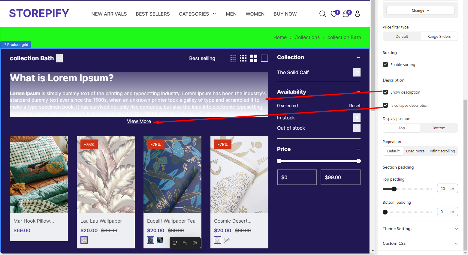
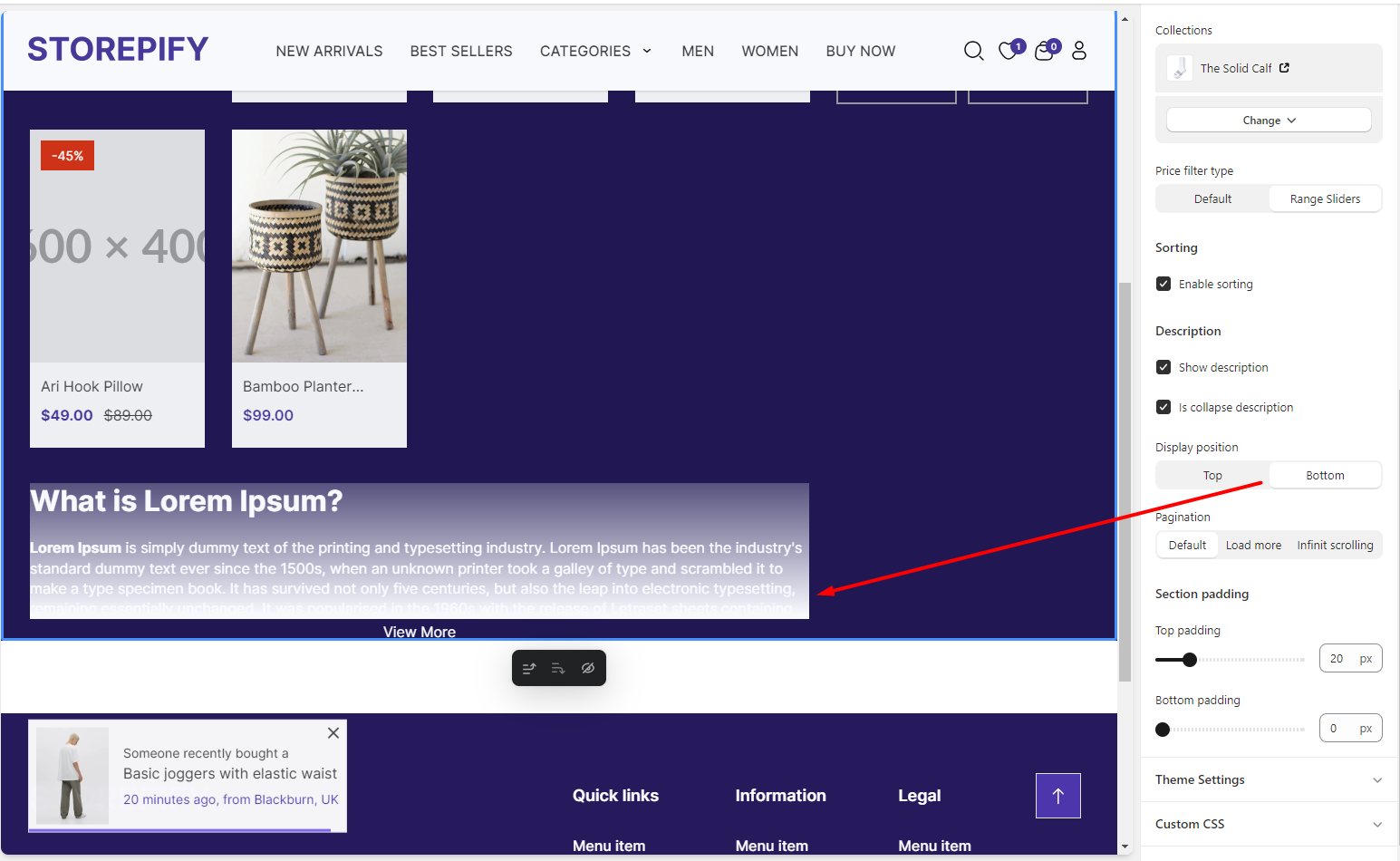
Display position: Choose where the description appears.
Pagination: Choose a pagination style for the collection page.
Default, Load more or Infinit scrolling.
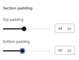
Section padding: Change the distance between the product grid and the top and bottom margins.
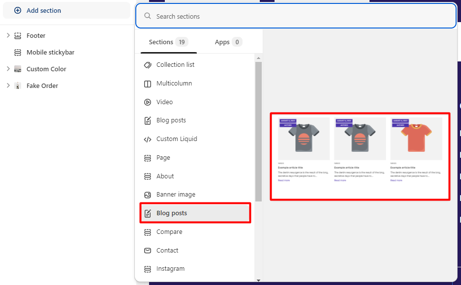
Add section
You can add new sections to the collection page.
Right next to it you can preview what you want to add.
The Collections page allows you to edit two sections: breadcrumbs and product grid.
Breadcrumbs
Layout
There are 3 layout types you can choose from: default, built container, and full width.
Default:
Fuild container:
Full width:
Image: You can add an image right above the breadcrumb section.
Color scheme: You can edit the color of the breadcrumb here.
Text alignment :
There are 3 text alignment types you can choose from: left, center, and right.
Left
Center
Right
Section padding: Adjust the spacing of the breadcrumb text from the top and bottom margins.
Product grid
Layout
There are 3 layout types you can choose from: default, fuild container, and full width.
Default:
Fuild container:
Full width:
Color scheme: Choose a color scheme for the collection list.
Products per page: Sets the number of products that are shown on the page.
Filtering
Enable filtering: Activate this option to enable the filter.
Enable auto open first collab: Automatically open the filter for users.
Sidebar position on desktop: Choose the display position of the sidebar on the collection page.
Left sidebar
Drawer sidebar
Right sidebar
No sidebar
Sorting: Show sort filter.
Description: Show description and is collapse description.
Display position: Choose where the description appears.
Pagination: Choose a pagination style for the collection page.
Default, Load more or Infinit scrolling.
Section padding: Change the distance between the product grid and the top and bottom margins.
Add section
You can add new sections to the collection page.
Right next to it you can preview what you want to add.
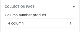
This Documentation is used for Classy – Minimal Multipurpose Shopify Theme.
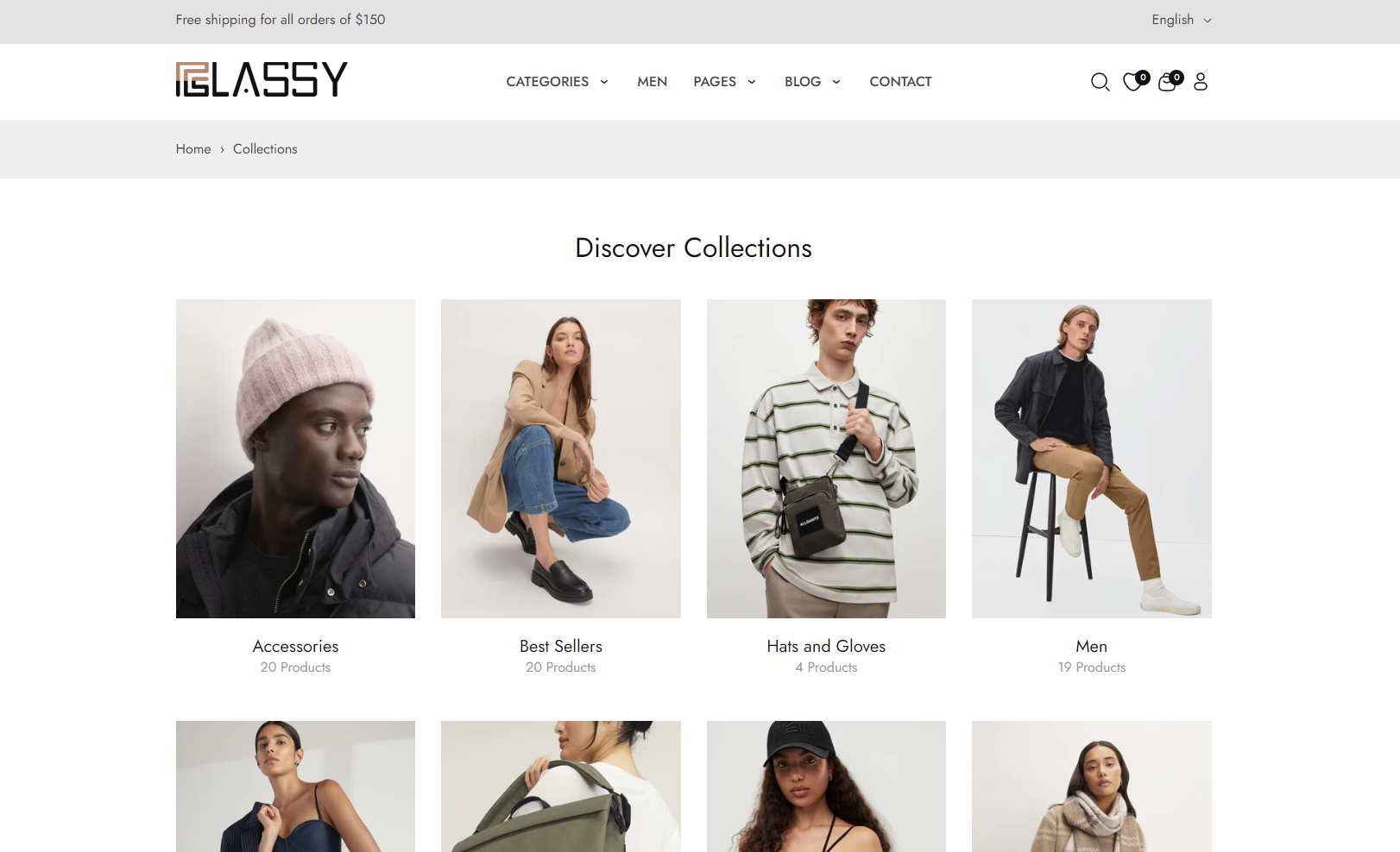
- Select the number of columns of product for collection page.